
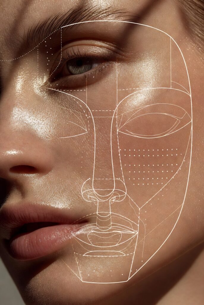
Understanding where to place each product on your face can feel like a puzzle with too many pieces. A 21 makeup placement face chart simplifies this by mapping out the exact zones for foundation, concealer, contour, blush, highlighter, and more. Instead of guessing or copying trends that don’t suit your bone structure, you gain a personalized roadmap that works with your unique angles and planes. This approach saves time, reduces product waste, and ensures every swipe of a brush serves a purpose.
Most makeup struggles come not from poor technique but from misplaced product. Applying bronzer too low or highlighter too wide can throw off your entire look. With a dedicated placement chart, you learn to work with your face’s natural light and shadow, enhancing what you love while gently balancing features you wish to downplay. The result is makeup that looks effortless, almost intuitive, rather than painted on.
Foundation Placement According to Your Face Chart
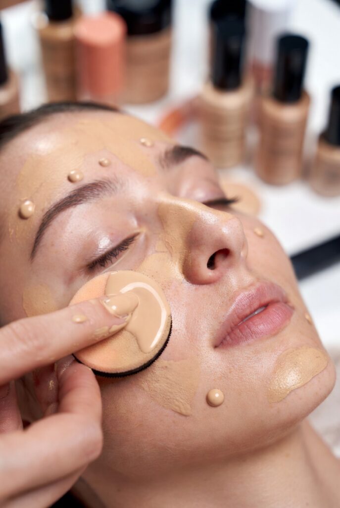
Foundation should never be a flat mask. A 21 makeup placement face chart shows you exactly where to concentrate coverage and where to let skin breathe. The densest application typically goes on the center panel of the face—the forehead, nose, cheeks near the nostrils, and chin—where redness and uneven tone are most common. From there, you blend outward with a lighter touch along the jawline, hairline, and lower cheeks, allowing natural skin texture to peek through for a more realistic finish.
Thicker foundation around the perimeter of the face often looks heavy and ages the skin. Your chart likely recommends a sheer layer along the temples and near the ears, since those areas naturally have less discoloration. Some placements even suggest skipping foundation entirely on the upper cheekbones where highlighter will later go. This strategic thinning creates dimension before you’ve added a single powder, making your skin look hydrated and alive rather than coated.
Concealer Zones That Brighten and Lift
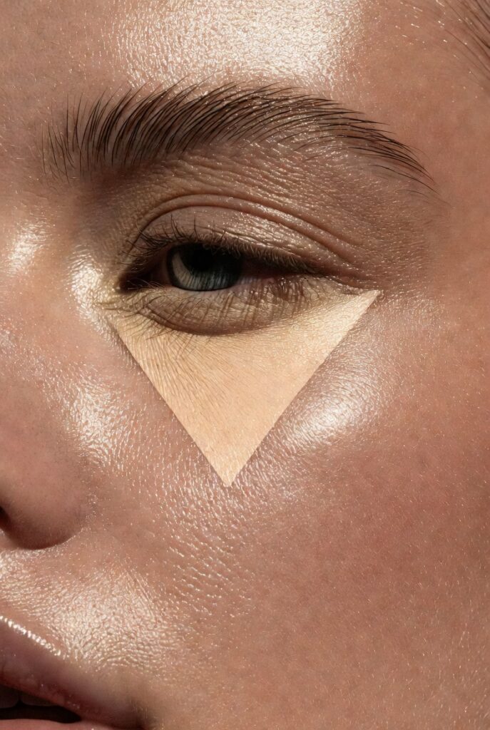
Concealer placement dramatically changes how rested and lifted your face appears. A standard 21 makeup placement face chart pinpoints four key triangles: under each eye, the center of the forehead, the bridge of the nose, and the cupid’s bow area above the lip. The under-eye triangle is most critical—its apex sits at the inner corner, sweeping down along the nose and out toward the lower lash line. This shape diffuses darkness far better than a tiny dot applied directly under the eye.
For lifting, the chart often marks a small dot at the outer corner of each eye and another at the downturned edge of the mouth. Placing concealer there before blending upward tricks the eye into seeing a subtle facelift. Avoid bringing concealer too far toward the temples or onto the mobile eyelid, as those spots crease quickly. When you map these zones correctly, you use less product but achieve more correction, letting your skin’s own contours do half the work.
Contour Lines That Sculpt Without Harshness
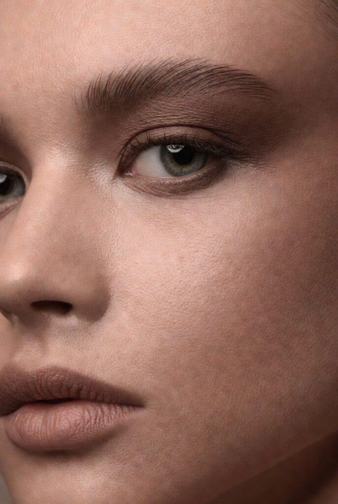
Contour is about shadow, not dirt. Your 21 makeup placement face chart draws narrow lines just below the cheekbones, along the sides of the nose, under the jawline, and across the upper forehead near the hairline. The cheekbone line should start near the ear at the top of your ear canal and angle down toward the corner of your mouth—but stop about two finger widths away from the mouth. Any closer and the contour pulls the face downward instead of lifting it.
The nose contour placement is equally precise: two thin lines running from the brow bone down both sides of the nose, fading out before reaching the nostrils. On the forehead, contour sits along the temples and the very top edge, never the center. And under the chin, a soft sweep along the jawbone defines the neck separation. Each of these placements mirrors where natural shadows fall under overhead lighting, so your sculpted look appears structural rather than painted. Use a cool-toned product and blend until the lines dissolve into a soft haze.
Blush Placement for a Natural Flush
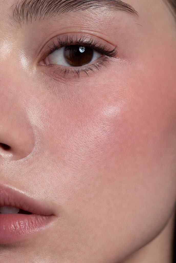
Blush placement changes your face’s entire energy. According to a thoughtful 21 makeup placement face chart, blush belongs on the apples of the cheeks but never solely there. The most flattering placement starts on the apples and sweeps diagonally up toward the temples, stopping about an inch before the hairline. This “lifted flush” mimics how blood naturally rises when you smile or exercise, creating a healthy, youthful vibe that also pulls the face upward.
For round or full face shapes, the chart might shift blush slightly higher and farther back, almost into the contour zone but with a lighter hand. On longer faces, blush spreads more horizontally across the cheeks to add width. Never place blush below the tip of your nose—that drags everything down. And keep blush at least a finger’s width away from the nose crease to avoid looking flushed from a cold. When you follow placement guides, one soft wash of color performs like a tailor, shaping your bone structure from within.
Highlighter Zones That Catch the Light Naturally

Highlighter loses its magic when applied everywhere. A precise 21 makeup placement face chart limits it to the high planes of the face that naturally reflect sunlight. These include the top of the cheekbones (not the whole cheek), the bridge of the nose (a thin vertical strip, not the entire nose), the cupid’s bow, the inner corners of the eyes, and a tiny dab on the brow bone just under the arch. Some charts also add a whisper of highlight to the center of the chin and the middle of the forehead.
The key is placement size: each zone should be smaller than a pencil eraser except the cheekbones, which can stretch about an inch. Avoid the sides of the nose, the lower forehead, and anywhere with visible pores or texture, as shimmer magnifies those areas. When you hit these exact spots, light bounces off your face in a controlled, radiant way that looks like healthy skin rather than a disco ball. The chart turns highlight from a gamble into a guarantee of glow.
Bronzer Placement That Warms Without Muddying
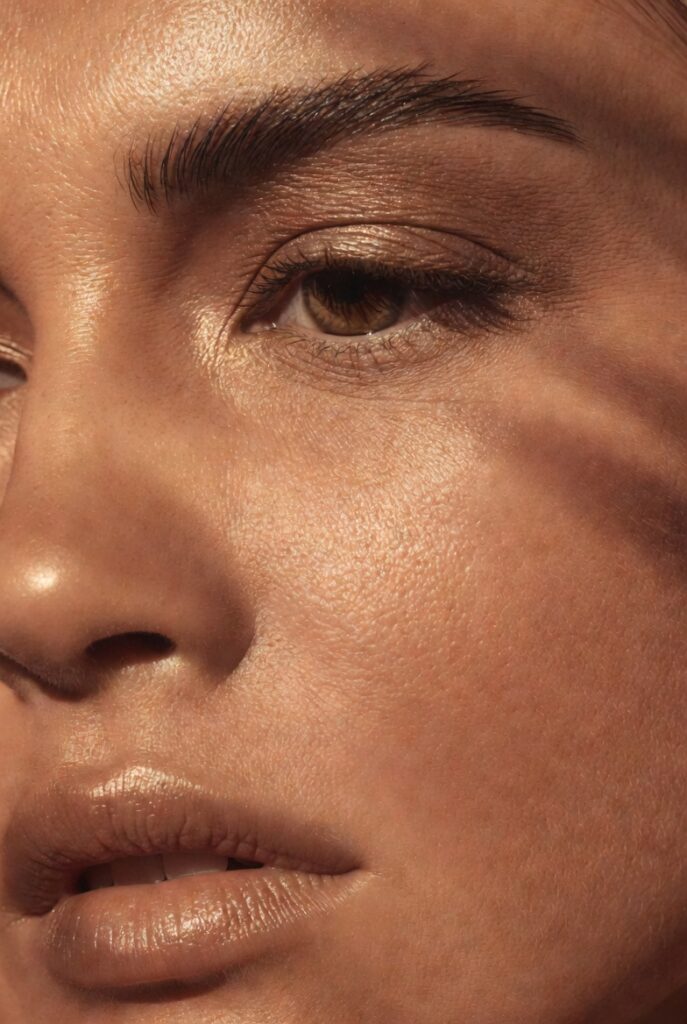
Bronzer is often mistaken for contour, but your 21 makeup placement face chart treats them as separate tools with different goals. Bronzer adds warmth where the sun naturally kisses your face: the top of the forehead near the hairline, the bridge of the nose, the tops of the cheekbones (not underneath), and the high points of the chin and jaw. Unlike contour’s shadowy lines, bronzer placement uses soft, circular zones that mimic a tan. Sweep it across the forehead in a gentle “C” shape from temple to temple, staying above the brow bone to avoid looking dirty.
The most common mistake is applying bronzer all over the cheek area, which flattens your face. Your chart likely shows bronzer sitting above the contour line and below the highlighter, creating a sandwich of dimension. On the nose, place bronzer only on the bridge and the very tip, never down the sides. And keep bronzer away from the center of your face—the area between your brows, the middle of the cheeks, and the philtrum—because those spots rarely tan naturally. When you follow these zones, bronzer adds a believable warmth that makes your skin look sun-kissed rather than stamped with orange.
Setting Powder Zones for Longevity Without Cakiness
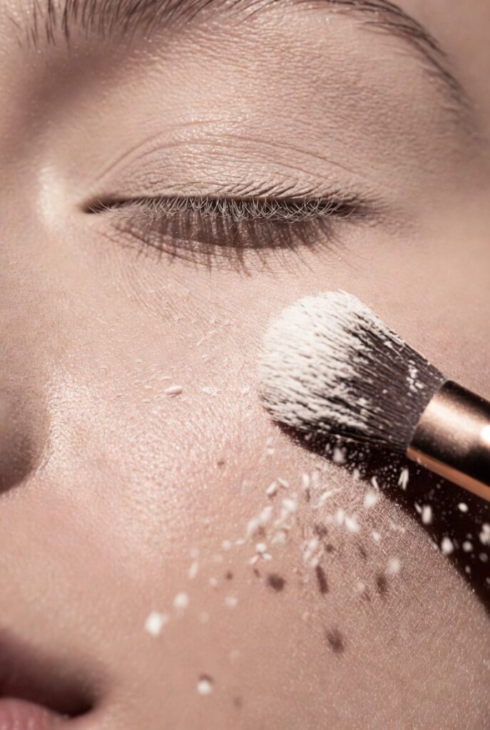
Setting powder should never coat your entire face. A strategic 21 makeup placement face chart limits powder to the areas that move, crease, or produce oil. These include the T-zone (forehead center, nose, and chin), the under-eye area (to lock concealer), and the smile lines around the mouth. The rest of your face—especially the cheeks, temples, and lower jaw—often looks better with a natural, unpowdered finish that maintains skin’s subtle sheen. This selective placement prevents that dry, flat mask that ages even the most hydrated skin.
For under the eyes, the chart often shows an upside-down triangle shape for powder, matching the concealer zone but slightly smaller. Press powder only where you applied concealer, avoiding the lower lash line to prevent irritation. On the nose, powder goes across the bridge and around the nostrils but skips the tip if you want a natural highlight. And on the forehead, concentrate powder in the center where shine appears first, feathering out toward the hairline. By following these precise zones, you control oil and creasing without suffocating the rest of your skin’s natural radiance.
Eyeshadow Placement Mapping for Depth and Shape
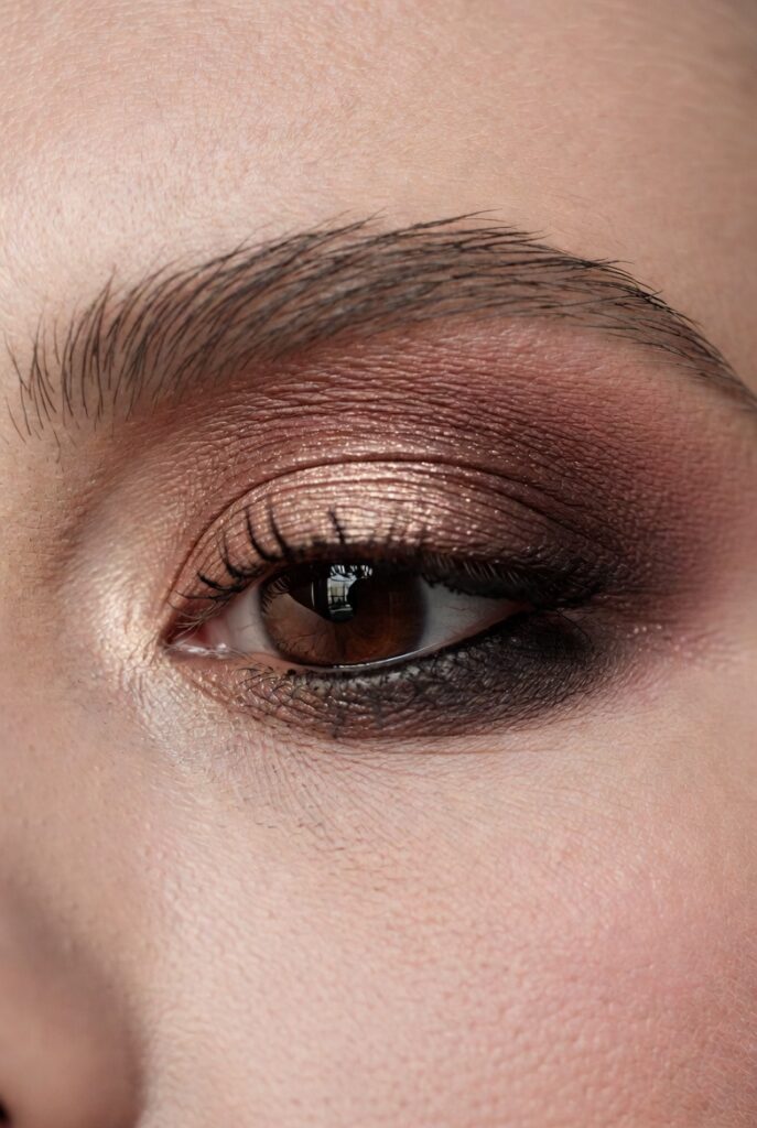
Eyeshadow placement transforms the eye’s perceived size and tilt. Your 21 makeup placement face chart typically divides the eyelid into five zones: the inner corner, the center of the lid, the outer V, the crease, and the brow bone. The inner corner gets the lightest shimmer to open the eye. The center of the lid carries your main color, applied flat and blended slightly upward. The outer V receives the deepest shade, placed at the very edge and blended inward along the lash line—this creates lift and depth without dragging the eye down.
The crease placement is the most powerful for reshaping. For deep-set eyes, keep crease color just above the natural fold. For hooded eyes, place it higher, almost to the brow bone, so it shows when eyes are open. And the brow bone gets only a whisper of matte highlight at the arch, never all the way across. The chart also marks a tiny shadow placement along the lower lash line: just the outer third, smudged softly. Avoid shadow on the inner lower lash line, which can make eyes look red or tired. When you map these zones correctly, eyeshadow acts like architecture, building dimension exactly where you need it.
Read also:27 Cover Up Tattoos Ideas: Transform Regret Into Art You’ll Finally Love to Show Off
Eyeliner Placement That Defines and Lifts
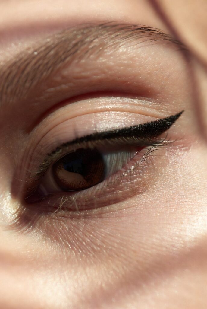
Eyeliner placement is about thickness, length, and angle. A detailed 21 makeup placement face chart shows liner concentrated at the upper lash line, starting thin at the inner corner and thickening gradually toward the outer corner. The wing or flick, if you choose one, should follow the angle of your lower lash line extended upward. Never draw liner straight out horizontally, which widens the face, or downward, which ages the eyes. The chart also marks a small triangle of tightline between lashes—this fills gaps without visible liner weight.
On the lower lash line, placement is optional and shape-dependent. For most faces, the chart suggests liner only on the outer third, smudged into the lash roots. Full lower liner closes the eye and makes it look smaller. Waterline placement (the inner rim) is marked for specific effects: black on the upper waterline adds density to lashes, while nude or white on the lower waterline opens the eye. Avoid placing dark liner in the lower waterline if you have small or deep-set eyes. These mapped placements ensure that every stroke of liner enhances your eye shape rather than fighting it.
Eyebrow Product Placement for Natural Structure
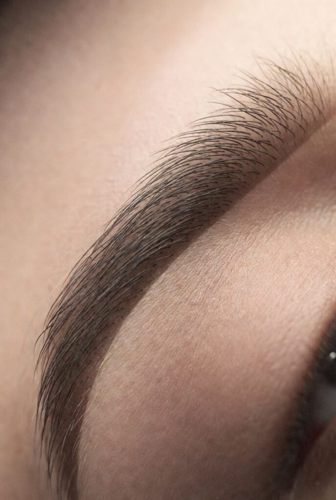
Eyebrow placement starts before you pick up a pencil. Your 21 makeup placement face chart begins with mapping your ideal brow shape using three reference points: the start (aligned with the nose bridge), the arch (aligned from the nose through the pupil), and the tail (aligned from the nose through the outer corner of the eye). Product placement follows: filler goes only in sparse areas, never all over. The chart shows small dots where hairs naturally thin—often the arch and the tail—with lighter strokes at the front of the brow to avoid harsh squares.
For brow gel or pomade, placement is directional. Apply upward at the front third, then angle sideways across the middle, and finish with downward strokes at the tail. The concealer placement around brows is equally important: a thin line just under the arch and along the bottom edge cleans up shape, but never outline the entire brow, which looks fake. Highlight under the arch should be no wider than the brow itself. Following these mapped zones gives you brows that frame your face naturally, even if you have very little natural hair to work with.
Lip Contour and Liner Placement
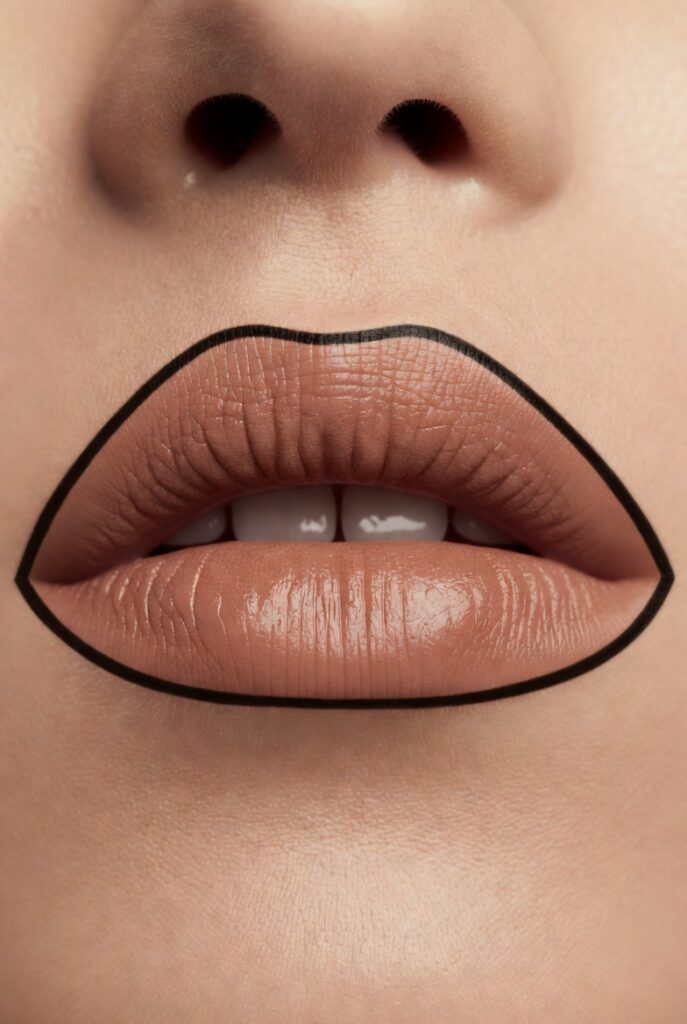
Lip liner placement changes how full and balanced your mouth appears. A 21 makeup placement face chart shows liner along the natural vermillion border but with subtle overdrawing only in specific spots: the center of the upper lip (cupid’s bow) and the center of the lower lip. Never line the outer corners of the mouth, as that shortens the lip line and creates a downturned look. Instead, keep liner inside the corners or fade it out completely before reaching them.
For reshaping, the chart marks small adjustments. To make lips look wider, place liner slightly outside the natural corners but blend inward. To make a thin upper lip appear fuller, concentrate liner just above the cupid’s bow and the peaks, leaving the sides of the upper lip natural. And always blend liner toward the center of the lips before applying lipstick, so no hard line remains. This strategic placement transforms lip shape without the obvious drawn‑on look.
Lipstick and Gloss Placement for Dimension
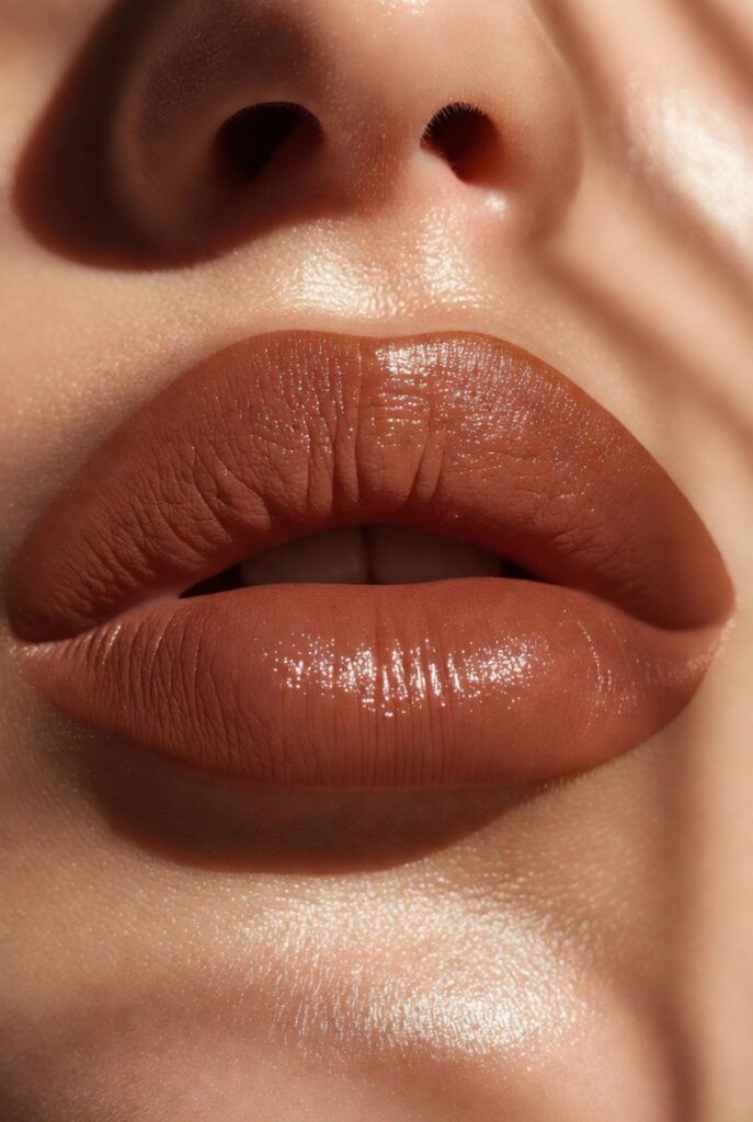
Lipstick should not be applied like a coloring book. Your 21 makeup placement face chart recommends placing deeper shades on the outer thirds of both lips and lighter or brighter shades in the center. This creates a natural gradient that mimics how light hits the fullest part of the mouth. Start by applying lipstick to the center of the lower lip, then press your lips together to transfer color outward—this automatically leaves more pigment where you want it.
For gloss, placement is even more targeted. Dab gloss only on the center of the lower lip and the very peak of the cupid’s bow. Avoid spreading gloss to the edges, which can make lipstick bleed and look greasy. The chart also shows a small highlight placement above the cupid’s bow (not on the lip itself) to further define the shape. When you follow these zones, your lips look plumper and more dimensional without any injections or overlining tricks.
Color Corrector Zones for Neutralizing Discoloration
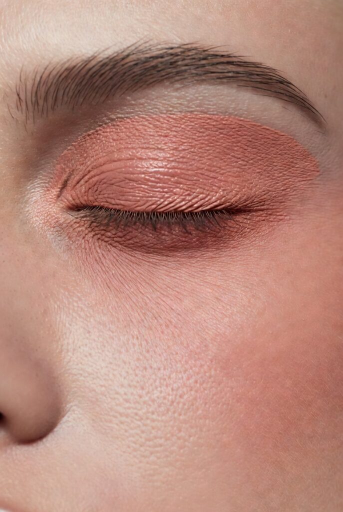
Color corrector only works when placed on the exact discoloration. A 21 makeup placement face chart divides corrector by shade: green goes on red spots, acne, and rosacea patches—never on healthy skin. Peach or salmon sits under the eyes to cancel blue‑purple darkness, applied only in the inner two‑thirds of the under‑eye hollow. Lavender touches yellow or sallow patches on the forehead, chin, and around the mouth. Yellow corrects purple bruises or dark veins near the temples.
The chart warns against blending corrector all over. Each corrector stays in its own zone, and you apply foundation or concealer only on top, without dragging the corrector away. For under‑eye peach corrector, place three small dots: one at the inner corner, one in the middle, and one at the outer edge of the dark circle—never past the orbital bone. This targeted placement neutralizes without turning your face into a muddy rainbow.
Under‑Eye Brightener Placement for Awake Eyes
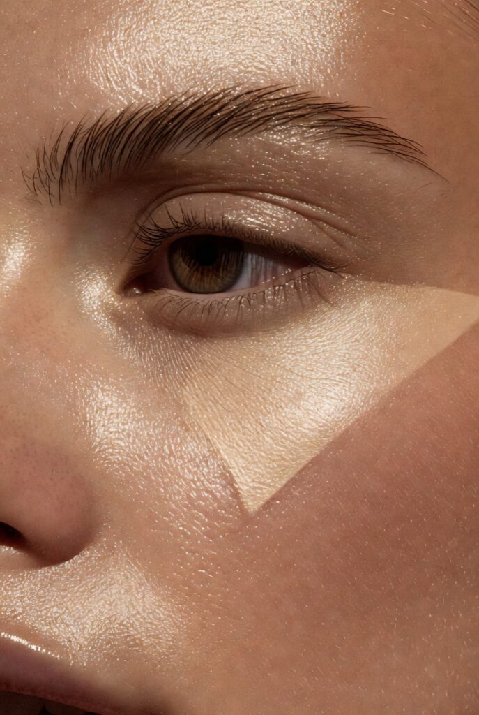
Under‑eye brightener is different from concealer and corrector. Your 21 makeup placement face chart shows brightener placed in a very thin crescent shape directly along the lash line, from the inner corner to the middle of the lower lash line. This is where shadows are darkest when you’re tired. Avoid putting brightener lower down on the under‑eye bag or puffiness, as that actually emphasizes texture by reflecting light off every bump.
The chart also marks a brightener dot at the inner tear duct and another at the outer corner where the upper and lower lids meet. These two small points instantly widen the eyes. Never apply brightener to the entire under‑eye area—that creates an unnatural, ghostly glow. When you stick to these three tiny zones, you look rested and bright without looking like you tried too hard.
Nose Contour and Highlight Specifics
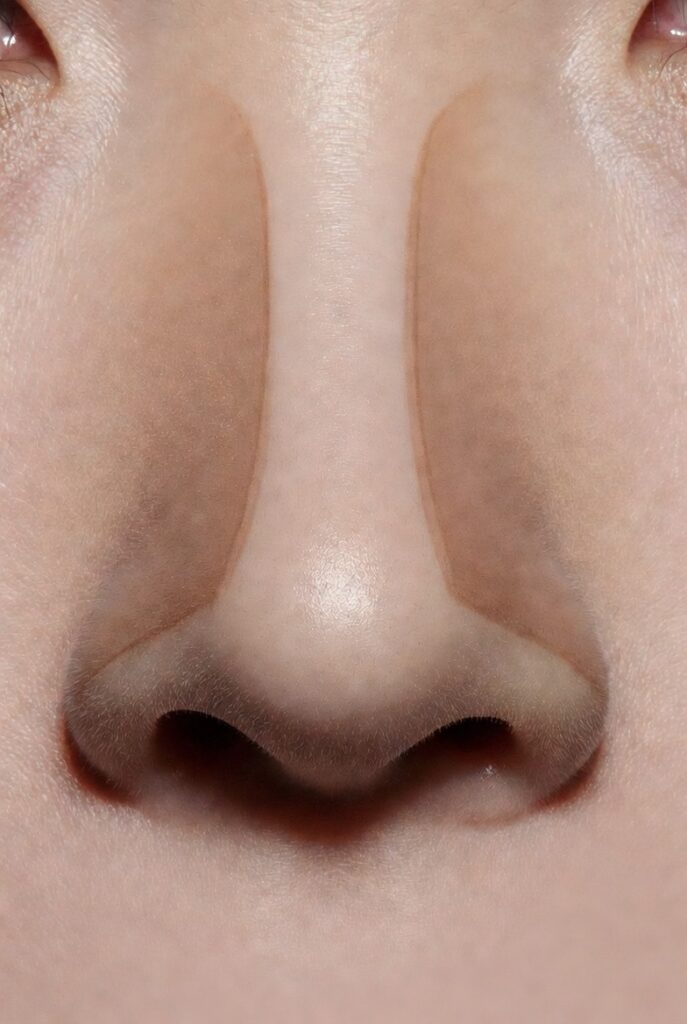
Nose contour deserves its own detailed placement. A 21 makeup placement face chart draws two lines from the brow bone down the sides of the nose, but with a crucial twist: the lines stop halfway down the nose, not all the way to the nostrils. This shortens the appearance of a long nose. For a wide nose, the lines start closer together at the top and angle slightly outward, then fade before the nostrils. For a crooked nose, place contour only on the side that bends outward, leaving the other side bare.
Highlight on the nose is equally precise. Place a thin vertical strip from the bridge to just above the tip, but skip the very tip unless you want a button‑nose effect. Some charts also add two tiny highlight dots on either side of the nostrils to soften a bulbous tip. And never put contour or highlight on the sides of the nostrils—that draws attention to flaring. These nose‑specific placements reshape without looking like you drew on a new nose.
Jawline and Chin Contour Placement
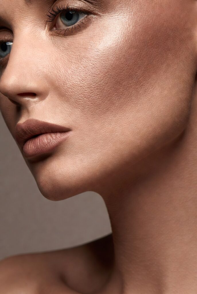
The jawline is often overlooked in face charts. Your 21 makeup placement face chart marks contour along the underside of the jawbone, not on the front of the chin. Start at the ear lobe and sweep forward along the bone, stopping about an inch before the chin’s center. This defines the jaw without creating a beard shadow. For a soft double chin, place contour slightly lower, just above the Adam’s apple area, blending upward.
For the chin itself, contour goes only in two small dots on either side of the chin’s center, just below the lower lip’s shadow. This creates a subtle cleft effect. Highlight goes right in the center of the chin—a single dot, no larger than a grain of rice. Avoid dragging any product onto the front of the chin excessively, as that area moves when you talk and will crease. These jaw and chin placements frame the lower face with sharpness but not severity.
Temple and Forehead Shading
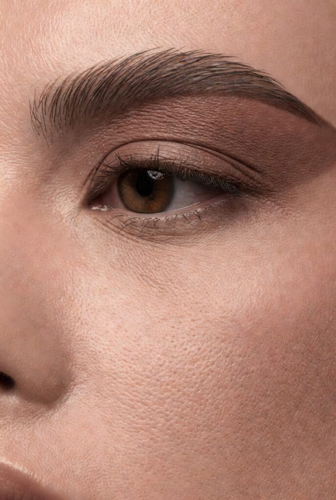
The temples and forehead edges shape the entire upper face. A complete 21 makeup placement face chart shows contour or bronzer placed in a crescent shape from the outer brow to the hairline, wrapping around the temple hollow. This recesses the sides of the forehead, making the center appear more prominent. For a high forehead, place this shading lower, almost to the middle of the forehead. For a narrow forehead, keep it close to the hairline only.
Highlight on the forehead goes in one spot: the center, just above the glabella (between the brows). Never highlight the entire forehead, which looks greasy. The chart also marks a tiny matte powder placement on the upper forehead near the hairline for those who want to reduce a prominent brow ridge. When you shade and highlight these upper zones, your forehead acts as a smooth, balanced frame for the rest of your makeup.
Cheekbone Inner Highlight (The Glow Spot)
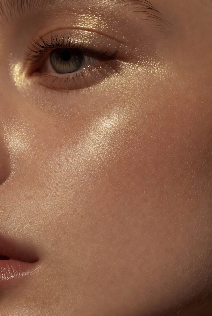
Beyond the main highlighter zone, a 21 makeup placement face chart often includes a secondary glow spot. This sits on the highest point of the cheekbone, closer to the nose than the usual highlighter placement. It’s a tiny dot, about the size of a lentil, placed directly under the outer corner of the eye but on the cheekbone. This catches light when you turn your head and gives a wet, glass‑skin effect.
This inner cheek highlight works best with cream or liquid formulas. Apply it after foundation but before powder, tapping with a finger. Never blend it out widely—keep it concentrated. The chart also suggests this same product on the very tip of the nose and the center of the lower lip for a cohesive glow. Most people skip this placement, but it’s what separates professional makeup from everyday looks.
Smile Line and Nasolabial Fold Concealer
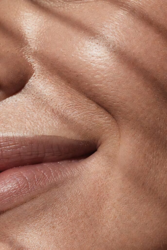
Nasolabial folds (smile lines) require a special concealer placement. Your 21 makeup placement face chart draws a thin diagonal line starting from the nostril edge and following the fold downward, but only for about half an inch. Do not fill the entire crease. Instead, place concealer just above the fold, on the cheek side, then blend downward into the fold. This fills the shadow without caking inside the line.
For deeper folds, the chart shows a second placement: a tiny dot of brightener at the bottom end of the fold, near the mouth corner. Never put heavy product directly in the fold itself, as it will settle and accentuate lines. Also avoid powdering the fold heavily. When you follow this specific placement, smile lines become less visible in photos and natural light without looking filled or frozen.
Under‑Nose and Cupid’s Bow Highlight
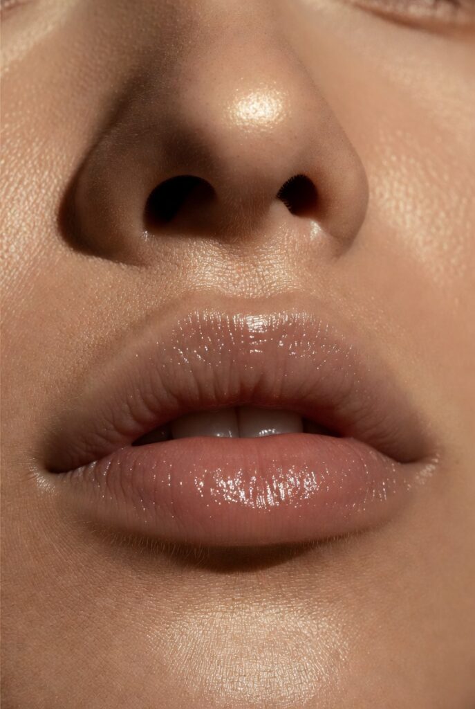
The area under the nose is often forgotten. A thorough 21 makeup placement face chart marks a small matte highlight just above the upper lip’s center, below the nose. This lifts the philtrum and makes the cupid’s bow pop. Use a concealer one shade lighter than your skin, placing a tiny rectangle no wider than the nose’s base. Blend upward into the nose’s shadow, not downward into the lip.
For the cupid’s bow itself, the chart shows two diagonal lines of highlight following the peaks of the upper lip. These should be very thin—almost like eyeliner strokes—and placed only on the lip’s border, not above or below. When combined with the under‑nose highlight, your mouth area looks lifted, symmetrical, and more defined. Many people skip this zone, but it takes only five seconds and changes your entire smile.
Fake Freckle Placement for Youthful Texture
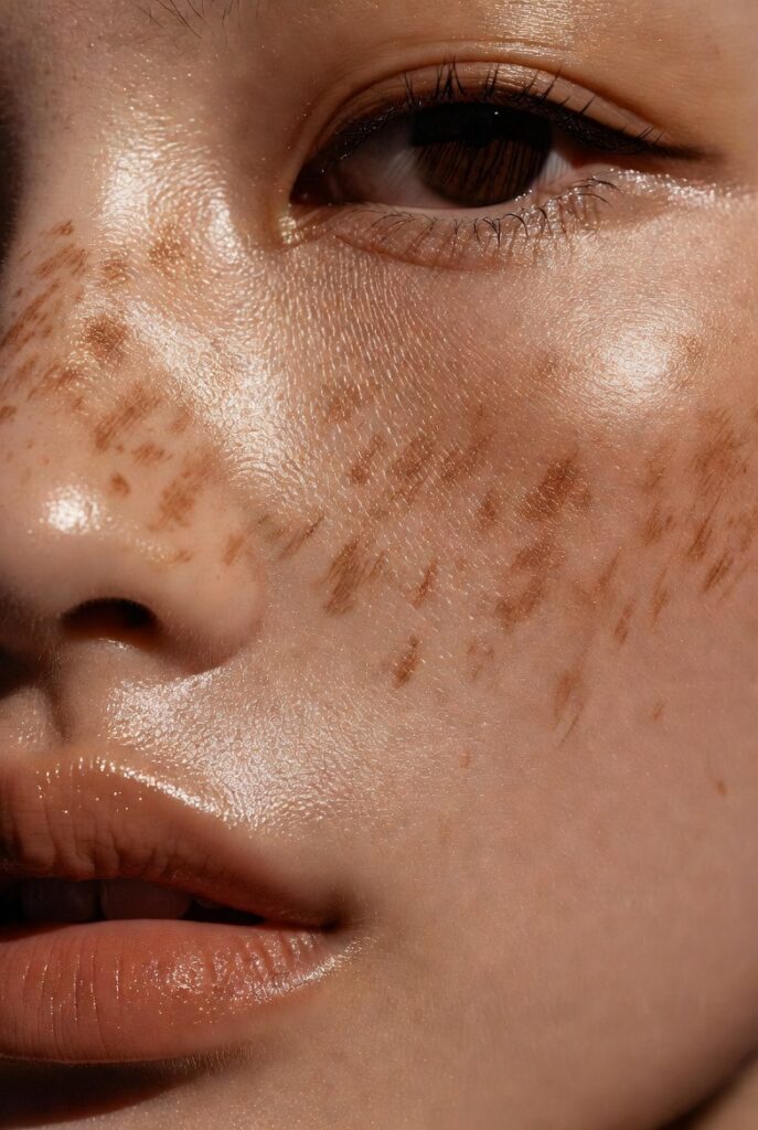
Fake freckles are trendy, but placement makes them believable. Your 21 makeup placement face chart shows freckles concentrated on the nose bridge and the upper cheekbones, directly across the face in a loose “butterfly” pattern. Never place freckles on the forehead, chin, or under the eyes. The chart also marks density: more freckles near the nose, fewer as you move toward the temples. And freckles should never be perfectly round or evenly spaced.
For natural effect, the chart suggests varying sizes using a small brush or freckle pen. Place the darkest freckles on the highest points of the cheeks and the tip of the nose. Then add lighter, smaller dots around them. Avoid the center of the cheeks where blush goes, as freckles there look like dirt. And never connect freckles into lines. When you follow these placement rules, fake freckles look like a genuine summer souvenir, not a makeup mistake.
Setting Spray Placement and Direction
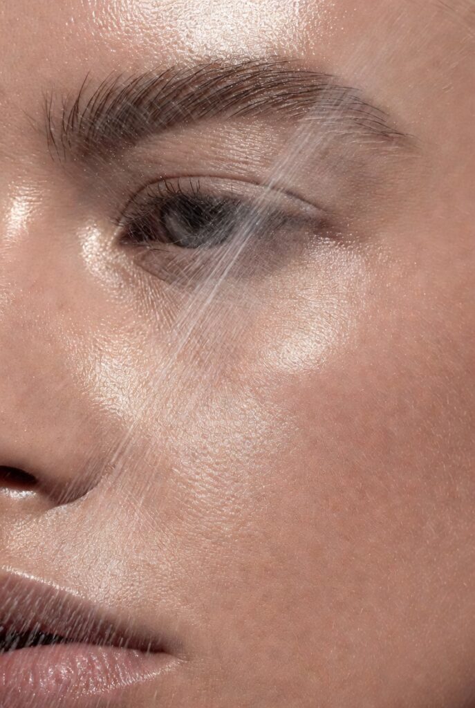
Even setting spray has a placement strategy. A 21 makeup placement face chart shows three spray zones: the T‑zone (two sprays from above), the cheeks (one spray from each side angled inward), and the chin/jaw (one spray from below). Never spray directly onto the center of the face from straight on, which pushes product into fine lines. The chart also marks a spray‑free zone around the eyes and nostrils to avoid irritation.
For longevity, the chart recommends spraying from eight to ten inches away, with quick, sweeping motions. The first pass covers the forehead and nose. The second pass covers each cheek from the side. The final pass comes from below the chin, catching the jaw and lower lip. Avoid overspraying the same zone twice. When you follow these directional placements, setting spray creates an even, invisible film that locks everything in place without disturbing your carefully mapped makeup.
Conclusion
A 21 makeup placement face chart transforms makeup from guesswork into a reliable, repeatable system. By mapping each product to its precise zone—whether it’s the triangle of concealer under your eyes or the tiny dot of highlight on your cupid’s bow—you work with your face’s natural geometry instead of against it. The result is makeup that looks like better skin, not more product. Start with one or two placements that address your biggest frustrations, then build from there. Your face has the roadmap; now you just have to follow it.

Mehboob Ahmad is the founder and writer behind BeautyVibeWorld. With a genuine passion for skincare, makeup, and everyday beauty routines, Mehboob started this platform to share simple, practical, and research-backed advice that real people can actually use without the confusion of conflicting trends and overhyped products.
Every article on BeautyVibeWorld is written with care, backed by research, and regularly updated to stay accurate and relevant. Mehboob believes good beauty advice should be honest, easy to follow, and free of unnecessary complexity.
Outside of writing, Mehboob enjoys exploring new beauty trends and staying up to date with the latest in skincare and haircare research to keep bringing fresh, reliable content to BeautyVibeWorld readers.